With UK eCommerce growing almost 50% in 2020 as a result of the COVID-19 pandemic, there has never been a better time to develop an online store for your business and sell your products virtually. Whether you operate in B2C or B2B, there are serious opportunities to be had with the right marketing and sales strategy, but it all starts with a well-optimised website, designed for conversions and maximising average order values. We’ve put together some tips for both startup eCommerce brands and established players to help entice your visitors into adding more products to their basket and ultimately become more valuable customers.
The advice we’re offering below covers both cross-selling (where customers are encouraged to add additional products or services on top of their original purchase) and upselling (where customers are pushed into ‘upgrading’ their products into more expensive, profitable items).
Start with your homepage
The vast majority of your customers will land on your homepage before any other action of your website, and because of this, it should be your top priority when optimising for sales.
A good homepage not only needs to establish your brand but also showcase your products and offers. Conduct competitor analysis to see how your rivals’ homepages are laid out for some inspiration and remember that A/B testing can help you identify the highest-converting designs. The truth is that optimising for sales will require some trial and error, so experiment!
Perhaps one of the most effective elements to include on an eCommerce homepage is a ‘recommended for you’ tab, where you can use data from your customer’s previous browsing and purchasing history to show off products they might be interested in. A fashion store, for example, could highlight polish and laces to customers who’ve bought a new pair of shoes, whilst product bundles are a great way to cross-sell. For instance, if your store specialises in American candy, you could promote a “Netflix Night In Package” with your popular products.
Your homepage should be engaging, attractive, and bold, but be careful not to overwhelm first-time or returning visitors. Keep navigation front and centre and let visitors find their way around – they might not buy immediately, but with the right design, they’ll be likely to return.
Optimise your product pages
Your product pages are already well-optimised for SEO and conversions, but the chances are that you haven’t considered their potential for upselling. According to data from Crazy Egg, upselling is 20 times more effective than cross-selling on product pages.
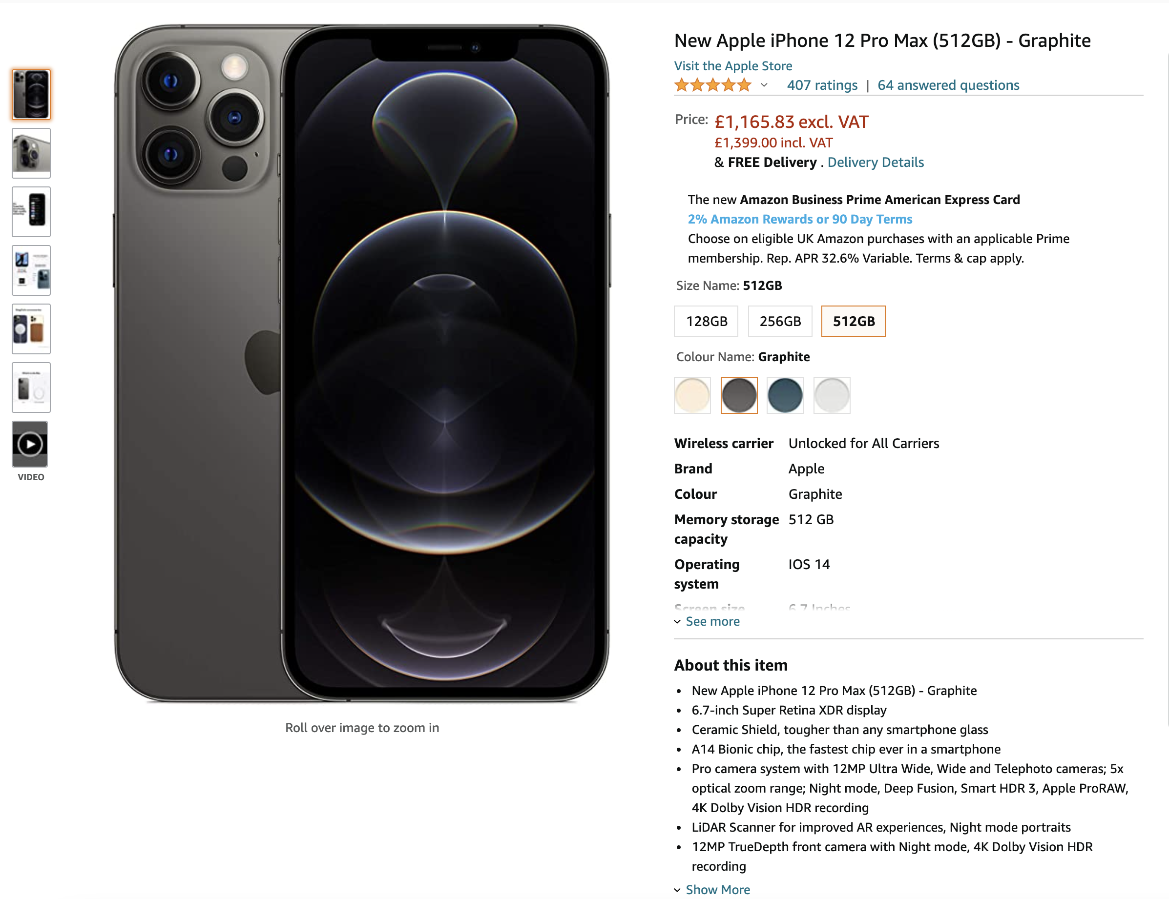
Work hard to establish credibility, demonstrate the value of your product, and highlight the benefits of upgraded alternatives. Some eCommerce giants, like Amazon, have streamlined product pages to boost upselling – rather than regular and deluxe products on different pages, customers can cycle between the different options before adding one to their cart. More often than not, the most expensive product option or configuration is pre-selected.

If you find that cheaper products are getting most of the attention, put the spotlight on your premium upsells and have cheaper options appear only as a dropdown option on the ‘add to basket’ module. The more prominent your preferred options are, the more likely users are to buy them – adding some friction in order to access those entry-level products could help you.
Consider interactive elements
Another way to increase average order value, either through upsells or cross-selling, is to develop interactive content for your customers. A good content marketing strategy will drive a significant amount of organic traffic to your website, but it’s how you capture their attention once they land on your website that counts.
Interactive content is a great way to build loyalty and educate customers on your product specifications. Whether it’s a drag-and-drop infographic or a quiz, where customers can receive personalised recommendations based on their skin type (i.e. “Answer These Questions for the Cure to Your Acne Problem”), there are so many options to consider.
Plus, the more entertaining your content is, the more likely customers are to engage and discover products to add to their shopping baskets. Shareability should also be considered when developing interactive content – with a push, you could create a viral social media quiz.
This type of content doesn’t have to be exclusive to your blog – you can add interactivity to product pages and landing pages, too, like chatbots that offer product recommendations.
Hone in on the checkout page
Your checkout page is your last opportunity to increase average order values, and it’s often the most effective method. Just like how supermarkets place confectionery and low-cost goods at the checkouts to encourage you to place them in your trolley, your eCommerce site can do the same. Post-purchase selling can be tough, as customers won’t want to pay for shipping for a £5 item they find after they hit “Checkout”, so you just entice them beforehand.
Place complementary products in the sidebar of checkout pages, add extra layers before users get to the “buy now” button where you can recommend additional items, and consider pre-selecting premium products over the cheapest options during the checkout page, though only if customers have already added it to their cart. Offering a guest checkout option is also advisable, though remember that this will limit the data you can collect on them post-sale.
Adapting your website and app design to maximise sales and conversions will take time and require some testing, but it should result in increased average order values as well as more engaged customers. Contact Zudu today on 01382 690080 if you’re looking for help with eCommerce web or app development and check back soon for more optimisation strategies.


