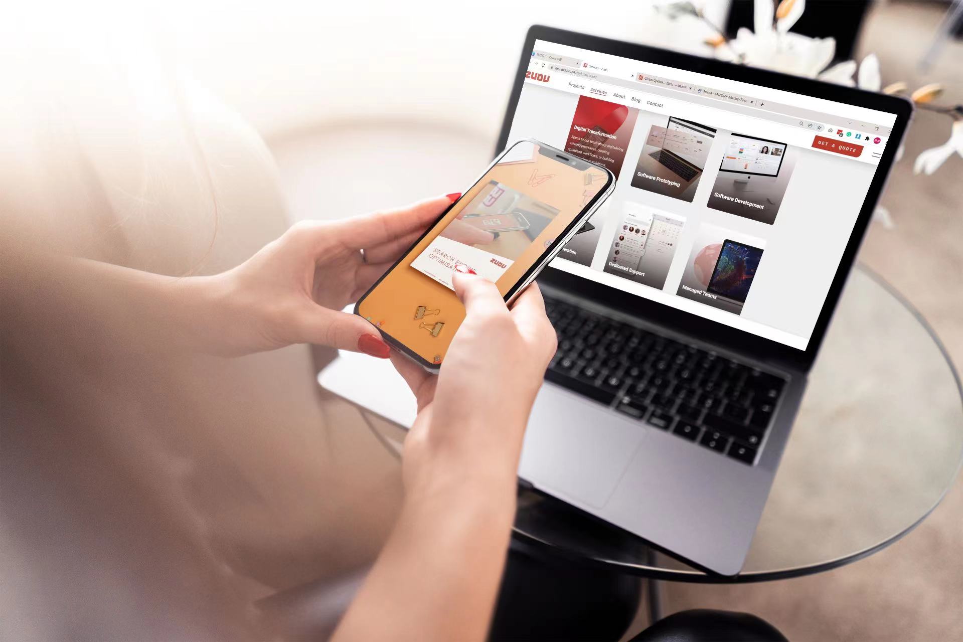
More than just a pretty face!
Website design is much much more than creating something that ‘looks pretty’. Having a great looking website is no longer a ‘nice to have’. It’s 2015 and having a great-looking website is an essential ingredient in almost every industry sector.
Your website should be seen as your core infrastructure for winning business online. It is the cornerstone of your online presence, the destination you are ultimately trying to push all of your online viewers from various platforms towards.
Why? Because this is where you convert casual interest into enquiries and sales.
Now, for the lack of a better analogy, let’s imagine you are planning a holiday…
- The sales rep made it sound great, check.
- The Brochure looks good, check.
- Online reviews seem pretty good, check.
Seems like the perfect place! Exciting! You’re booked, packed & ready to enjoy your experience.
…Now imagine your disappointment when you arrive at a half finished hotel and you find that getting to the beach is an hour long walk.
Whilst it happens an awful lot quicker online a similar sort of process does take place. A variety of interactions can encourage someone to visit your website. Your biggest concern should be making your destination somewhere they want to be when they arrive.
A website with poor design, which feels a bit rushed or is incomplete is like your unfinished hotel. A clunky user interface that gets in the way of your customer engaging with your product or making an enquiry is the hour long walk to the beach.
So to help you create the perfect destination to sell to your customers we have put together a pragmatic list of the Zudus and Zudon’ts of website design:
Zudu: Prioritise your layout
When you are designing your website it is important to prioritise. You no doubt have a variety of images, textual information and buttons that need to appear somewhere on your site and of course you only have a limited amount of space to display everything.
This makes prioritisation very important.
Try making a list of the various ‘items’ you intend to display on the various pages of your website. Which items should take pride of place? It seems obvious but actually going through this process will help you no end. It will ensure that you don’t have a huge amount of focus on your T’s & C’s button whilst having a tiny, barely visible ‘contact us’ button.
Zudon’t: Be scared of white space
How many times have you visited a website that looks ‘too busy’? I imagine you can think of one or two.
When you hit a website that has GIFs everywhere, walls of text, hundreds of buttons and flashing lights it probably makes you want to leave the site. It would certainly make a lot of people leave.
The main reason this happens is that when people see some white space they instinctively try to fill it. Ever noticed how much bigger you write on a flip chart than on a post-it note? Well it’s kind of the same thing.
Avoid this trap…don’t be scared of white space. If you have a ‘contact us’ button surrounded by white space that is probably a good thing. Your visitor has one thing to focus on and is much more likely to get in touch. If you have filled your white space with something irrelevant get rid of it, the white space is preferable.
Zudu: Follow the latest design trends
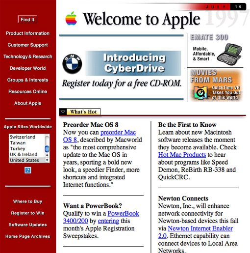
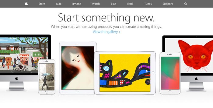
The internet is fluid, constantly changing and evolving. The organisations that leverage their web presence to its fullest potential are those that realise standing still is the equivalent of going backwards.
1997

2015

We all use the internet daily and research shows that an average user will visit 120 web pages every day. So while you are surfing the net why not just keep a keen eye on how the websites you’re visiting are changing? If you find a particular website design that you love then take 2 seconds to bookmark it! It can be a source of inspiration later.
If you can remain mindful of how web design is changing as you cruise the web then you will have a good idea whether or not your website is starting to look dated or whether there are new technologies and features you should be adopting to remain relevant.
Zudon’t: Get left behind
If you designed and launched your website 5 years ago and haven’t touched it since then chances are your website is starting to look a little dated or just a little plain and boring.
Innovation in web design ticks along mercilessly and is always finding new interesting, engaging ways to present information to users. Don’t see your website as an item on a to-do list that you can tick off, you need to keep iterating and reinvigorating it to ensure it remains a powerful business tool.
Zudu: Prioritise responsive design
You may have heard people talking a lot about Responsive Web Design (RWD). In a nutshell this means a dynamic website that can recognise the size of the screen it is being displayed upon and change its layout and functionality accordingly.
Why?
Well have you ever been on a website on your mobile phone where everything is the wrong size and you have to scroll around on the small screen trying to find the information you want? It’s incredibly frustrating!
That’s a guaranteed way to cut yourself out of the mobile web browsing market. Not a good idea considering most web searches are performed on a mobile phone these days.
In 2015 a responsive website isn’t a fancy ‘nice to have’ it’s an absolute minimum requirement.
Zudon’t: Consider responsive design to be an afterthought
A pitfall worth avoiding is thinking that you can build a beautiful website first and worry about making it responsive for mobile devices and tablets second. Here lies a lot of pain, frustration and wasted money.
If you have built a complex website without considering responsive design then trying to make it responsive after the fact is, in short, a nightmare.
If a developer does take on the arduous challenge of taking an existing site and making it responsive they will be making design compromises throughout, will be making slow progress at best and will ultimately deliver a weird sort of ‘half responsive’ site.
If you find yourself in this position my advice would be to start again. I know it doesn’t sound ideal but it seriously will be faster, cheaper and will result in a better website overall. Here is hoping you read about RWD before building your site!
Zudu: Take colour choices seriously
Colour is an extremely important aspect of website design. It may seem highly subjective but choosing the colour scheme of your brand and website can dramatically affect your user behaviour.
Colour is so important in fact that a field of research called ‘Colour Theory’ exists and professionals in the field take a detailed scientific look at how colour can elicit different behaviours and emotions.
We can’t cover everything here but I can highlight the importance of colour by offering a few snippets.
First of all it should be noted that people have clear, measurable psychological reactions to colour. Ever wondered why almost every ‘tech’ firm uses the colour blue in their logos? It’s because Blue typically encapsulates an image of logic, calmness, intelligence and efficiency and helps build trust. Contrastingly you may have noticed that gambling websites typically make use of bold primary colours like red. This is because red elicits feelings of excitement, fun and passion. Without being able to confirm it I would imagine that if you had two identical gambling websites with one that was bright red and one that was a pastel yellow the red site would see much more gambling activity.
Colours impact emotional states and can therefore encourage or discourage certain behaviours in users.
Another thing to consider is cultural differences. Rules on colour theory change from culture to culture as colours may represent very different things amongst different populations. For example in China, Japan and South Korea the colour purple is associated with expensive, high end products whilst in the USA people tend to associate the colour purple with discounted or cheap brands and products.
Colour Theory is a deep subject indeed so I would advocate dedicating some time to think about the use of colour in your branding, web design and marketing activities.
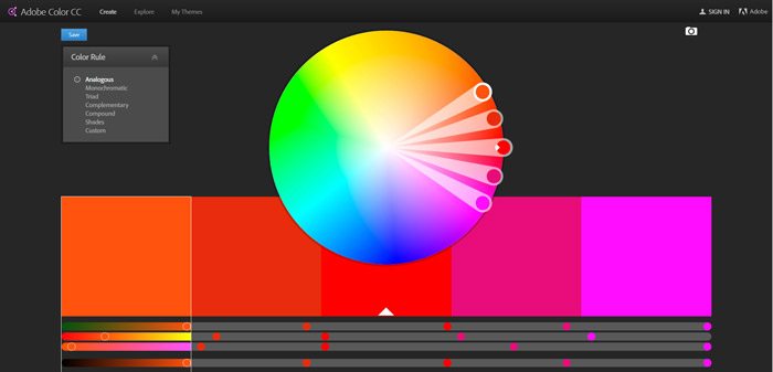
I’m conscious that I have just brushed the surface of colour here so will endeavour to give it some focussed attention in the future. In the meantime, in the interests of being helpful to anyone reading here is an awesome free tool I often use when playing around and testing colour schemes:
Adobe Colour Wheel

Zudon’t: Choose your favourite colour
I can keep this bit really short and sweet….Don’t just choose your favourite colour. If you do that then you are essentially deciding to ignore how truly important colour is.
So in today’s blog post we just scratched the surface of web design and looked at a few things that are worth considering. There is an awful lot more to learn. If you think our insight into the world of web design could benefit you then don’t hesitate to give us a shout!


