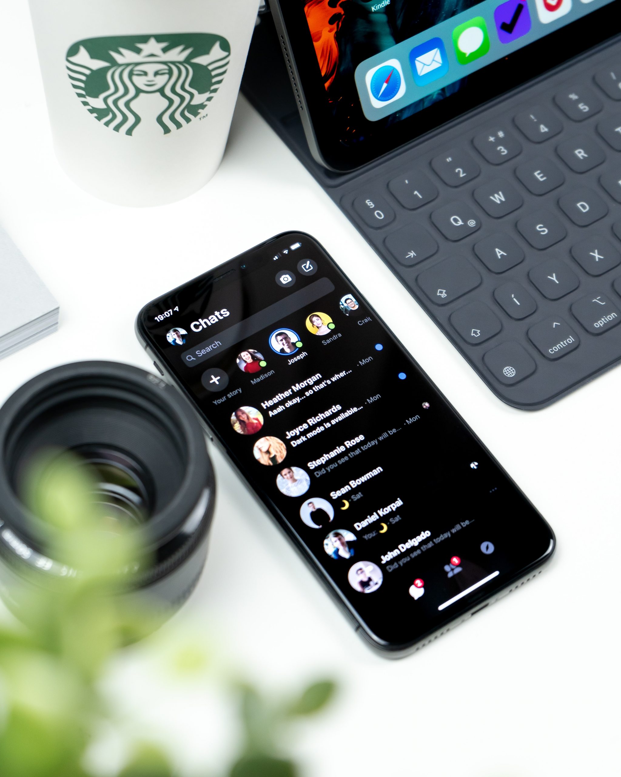
Are you ready to step over to the dark side? Don’t worry, no one is asking you to join the wrong side of a galactic conflict. What we are talking about is the latest trend that is popping in devices and apps around the globe; Dark Mode.
After years of bright white screens, Dark Mode is a new setting available on iOS devices that is turning heads and shielding eyes all at the same time. The aim of your iOS app should be to provide value to your users and to keep them using your app so you should be looking for new ways to increase engagement.
So, should Dark Mode be the next thing you add to your app to improve the experience of your users?
Let’s find out!
What is Dark Mode?
As the name suggests, Dark Mode is a new option available on iOS that changes the appearance of your apps and device. Instead of bright white backgrounds, you can instead expect stylish greys and sleek blacks.
To get the full effect, change your settings and open your calendar app – you’ll notice a real difference.
Benefits:
If you’re still on the fence about whether you should add this popular feature to your iOS apps, here are some of the great benefits your users will get from Dark Mode.
The health of your users
We’ve all been there. You’re sitting in a darkened room, you get a notification, you open your phone and suddenly you’re blinded by the light. Ok, this may be a little dramatic, but it can be very intense at the moment. Dark Mode has been designed to help combat this, and a number of other harmful effects of overexposure to bright light.
If you haven’t started doing so already, you should have the blue light filter turned on your device. Blue light, from bright screens, is harmful to our eyes and tricks our brains into slowing the release of melatonin, a.k.a the sleep hormone. This is why you may have noticed you struggle to sleep after using your phone or laptop before bed. Dark Mode, like your blue light filter, decreases the brightness of your phone and is kinder to your brain and your eyes.
Dark Mode won’t just benefit your users at night, it can also help them during the day too. Dark Mode reduces the brightness of your phone all day and can do the same for your app. The white light of our phones causes our eyes to strain, dry out, and become irritated. Incorporating Dark Mode into your app will protect your users’ eyes, allowing them to use your app for longer. Sounds like a win-win!
Battery Saving
Keeping your screen nice, bright, and white may look nice, but it takes a serious toll on your battery. Dark mode, however, can improve the battery usage of your app and in turn, improve the battery life of your user’s device. This impact has been particularly evident in OLED screens. Apple has been a little late to the party with these screens, however, they have indicated that all future versions of their devices will feature OLED screens. What this means for your users, is that they can get all the battery saving benefits of the Dark Mode settings on your iOS app.
Aesthetics
If you aren’t totally sold on Dark Mode just yet, take a moment to appreciate just how good it looks. Black never goes out of style and that is evident in the Dark Mode aesthetic. After years of bland white pages, screens, and backgrounds, Dark Mode offers something and exciting for users. Furthermore, colours pop more against the darker background making your app more pleasing to the eye.
If you feel your app could use a refresh, you may not need to go through the headache of a complete redesign – add Dark Mode and your iOS app will look brand new to all your users!
Final Thoughts
There are so many benefits of offering a Dark Mode option for your users. Outside of simply making the app look brand new, it can also help your users to get more out of your app and limit potential health concerns. All these benefits will add up to increased engagement for you, and a better experience for your users!


