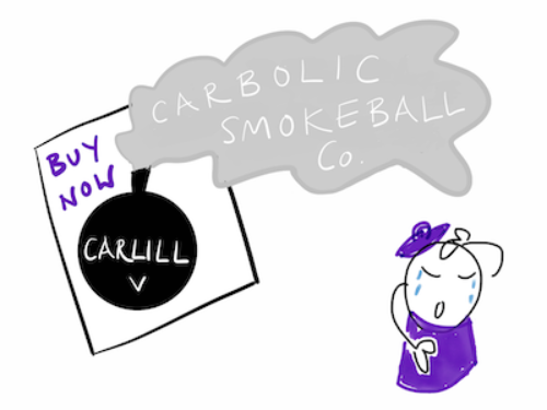

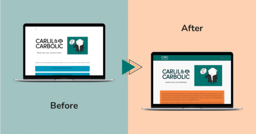
Zudu took on a redesign and redevelopment project for the law revision notes website, Carlil and Carbolic, to improve the site experience and help students across England and Wales study for their law exams. The website has a large asset library so optimising for speed was key, alongside creating a search engine optimised final solution that would outrank competitors.

Processes: Design, Development, Launch, Aftercare, SEO, PPC
Carlil and Carbolic’s founder, Hannah Palmer, came to Zudu with a vision to redesign her existing website in a way that would give her more control and flexibility over the look and feel of the site as it grew over time. She was previously using website builders but found them to be restrictive in their offering and wanted a more professional look to her site. Following the release of the new website and the first cycle of SEO work, we caught up with Hannah to get her feedback on the project & find out more about her highlights and next steps for Carlil and Carbolic.
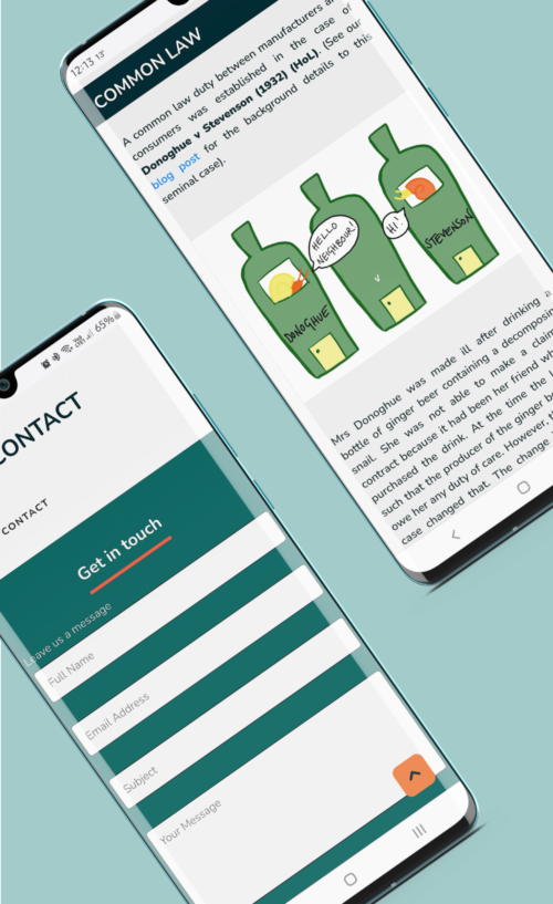
I studied the GDL (which is a law conversion course) and always thought that the resource materials were very text-heavy with no attempt to diversify the learning experience. Each legal case is a little story played out in court so there is lots of content that is easy to imagine as an illustration. When the first lockdown happened I took the opportunity to start drawing and it went from there.
I made the first version of the website myself as I didn’t want to invest too much money in something that only I thought was a good idea! The feedback I got and a number of people using the site encouraged me to find a web development company that could help me create a much more professional site.
more visitors within 1 month of launch
increase in average engagement time
point increase in SEO authority since launch
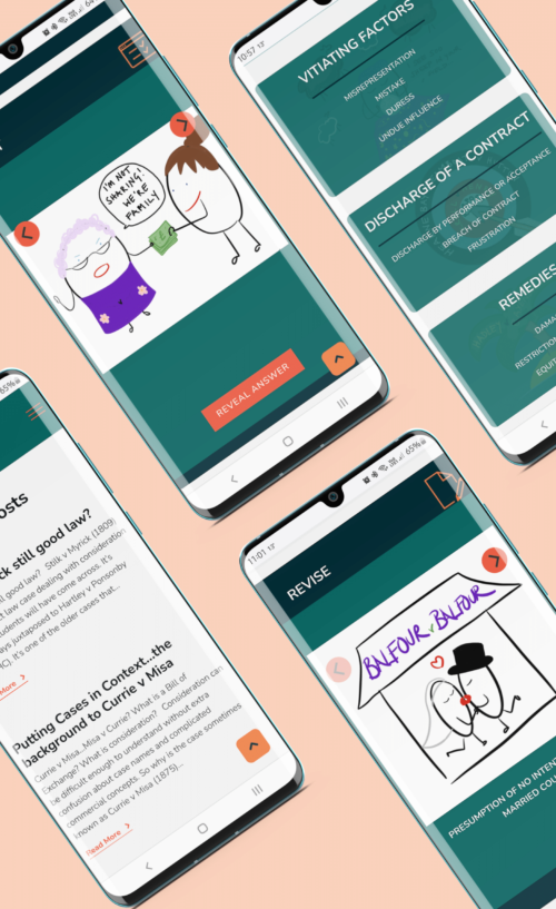
I really love the design; the colours and the look of the site. Also, the bespoke ‘Revise’ and ’Test’ sections that Ryan, the developer, created for me.
I thought it would be quite a simple text and image design but actually, it turned into quite a complicated project because of the number of pages and a large amount of content on each page but we got there in the end!
I plan to add more of the core law topics such as land law and equity and trusts. In the meantime, I will be adding a shop to sell flashcards and merchandise such as mugs with my illustrations on them. I’m also keen to add more interactive learning features.
It really depends on the day and the case – some illustrations just pop into my head and they are finished in about 10 minutes. Others take ages and I end up drawing and re-drawing them many times. I think my favourite drawing is for Smith v Hughes; firstly because I’m quite proud of my illustration of a horse (which is a nightmare to draw!) and secondly because of the really, really awful pun that I made up. I don’t imagine that anyone else finds it funny except me! The case is about a man who is sold the wrong kind of oats, young instead of old oats, for his horse and the legal issue is whether the quality of the oats is a term of the contract or a collateral issue.

Alongside redesigning the site and adding extra features to the front end, we also created a new, fully-customisable back end to the site that gives full control over page elements through the use of custom fields and blocks that can be added, removed, and edited as required. We also introduced new security features, and made it easier to edit SEO elements such as page titles, descriptions, image alt-text, and more.
One of the biggest challenges of the project for our designer and developer, Ryan, was figuring out a way to display all of the content and introduce functionality in a visually appealing way, as well as being mindful of UX and how users may use the site (including making it easy to find content, take screenshots, or print whole pages as part of students’ own revision notes)!
